Brand design is way more than just a unique logo or a catchy color palette; it’s the visual identity of a company. Your brand design reflects your company’s core values. When done right, it forges an emotional bond with your target audience. Think of your brand design like a bright lighthouse in a vast sea of competitors.
At Brand Cloud, we live and breathe branding—it’s even in our name! Today, we want to look into the top 10 examples of great brand design. We’ll explore what makes these designs exceptional and how you can apply their design mastery to your own company.
What is Brand Design?
Brand design is all about the visuals that represent a company—think logos, color schemes, typography, and the overall look and feel. It’s the complete visual package that shapes how an iconic brand is recognized and remembered.
Effective design is a marketing gold mine. Making a brand instantly recognizable and unforgettable. It shapes how consumers see the brand, building loyalty and trust along the way.
Characteristics of Excellent Brand Design
When it comes to great brand design, there are a few key ingredients that make the magic happen.
Consistency
Consistency is the glue that holds your brand together. By ensuring all visual elements—logos, colors, fonts—are uniform across every platform and piece of marketing material, you create a cohesive and recognizable visual identity. It’s like having your signature style that people can spot from a mile away.
Clarity
Clarity is king when it comes to brand design. Your audience should instantly grasp your brand’s message and values without any extra thought. A clear, straightforward design cuts through the noise and tells your story in a way that’s easy to understand. Remember, a confused mind never buys.
Emotional Connection
An iconic brand design doesn’t just look good—it feels good. It tugs at the heartstrings and forms an emotional bond with consumers. When people connect with your company on an emotional level, they move from potential customers to loyal ones.
7 Spectacular Examples of Brand Design
1. Apple: Effortless Elegance
When it comes to design, Apple is in a league of its own. After all, Apple isn’t the world’s most valuable brand for no reason. Their clean, minimalist logo and sleek products all but scream simplicity and elegance. But have you thought about why Apple’s design is so beloved? Let’s look into it.
Style and Simplicity
Apple’s design philosophy is all about keeping things simple while still being sophisticated. With clean lines and clutter-free interfaces, their products are as enjoyable to look at as they are to use. It’s a perfect example of how less really is more.

User-Centric Design
Apple has a knack for putting the most important person, the user, at the center of their design universe. Every product is crafted to be intuitive and user-friendly. Making the experience easy and enjoyable. This thoughtful approach not only wins hearts but also keeps customers coming back for more.
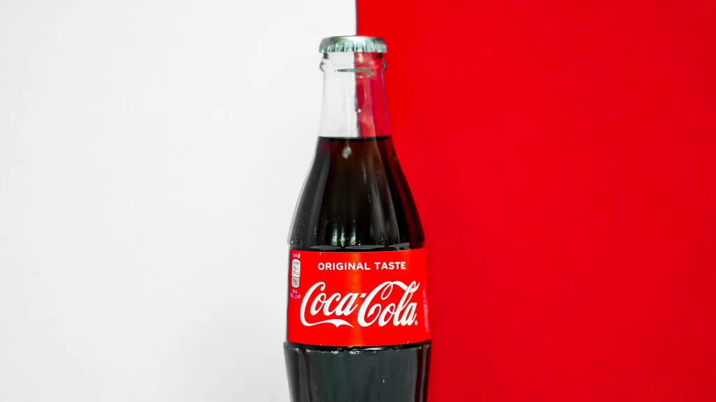
2. Coca-Cola: A Consistent Classic
When you think of iconic brand design, Coca-Cola is probably the first name that pops into your head. With its unmistakable red and white color scheme and classic logo. Coca-Cola’s design is truly the best when it comes to timeless branding.
Timelessness
Coca-Cola’s design has been a constant in an ever-changing world. While it has evolved slightly over the years, it has never lost its classic charm. The vibrant red and white color combo and that distinctive script logo—who could forget them? These visual elements evoke a warm sense of nostalgia and familiarity. Every glance at a Coca-Cola bottle is like a little trip down memory lane. And that’s exactly how Coca-Cola wants you to think of them.
3. Nike: Dynamic Design
When it comes to inspiring design, Nike is unbeatable. The iconic Swoosh and the empowering “Just Do It” slogan perfectly capture the brand’s athletic spirit.
Inspirational and Dynamic
Nike’s design is all about movement and energy. The Swoosh isn’t just a logo; it’s a symbol of speed and agility. The Swoosh logo is instantly recognizable. With its sleek, forward-moving shape giving that feeling of motion and power. Paired with the legendary “Just Do It” slogan, Nike’s design becomes a great motivator. Every element of Nike’s design exudes dynamism. Making you want to get up and move.

4. Google: Interesting Innovation
When it comes to playful and innovative design, Google is a true standout. The adaptable logo and interactive Google Doodles reflect the brand’s commitment to creativity and technology.
Creative and Engaging
Google’s design is characterized by its playful and inventive approach. The ever-changing Google Doodles keep the brand fresh and engaging, mixing user engagement with unique content for a powerful cocktail of success. In fact, Google has created over 5,000 Doodles since the first one in 1998. Showing just how well this idea worked.

5. McDonald’s: Universally Understood
When it comes to universal design, McDonald’s is in a league of its own. The iconic Golden Arches symbolize speed and efficiency. Something that the brand wanted from day one with its “Speedee Service System“.
Global Appeal
No matter where you are in the world, the familiar sight of the Golden Arches transcends language and cultural barriers. Paired with beloved characters like Ronald McDonald, the brand becomes more than just a fast-food chain—it’s a place where joy and accessibility meet. These elements work together to create an inviting atmosphere that people of all ages can enjoy.

6. IKEA: Iconic, Innovative, and Inviting
IKEA’s design is functional and affordable, with a focus on Scandinavian simplicity. The blue and yellow color scheme and practical product designs emphasize the brand’s identity design.
Functional and Affordable
IKEA’s design is all about making life easier and homes more beautiful. Their commitment to functionality and affordability aligns seamlessly with their mission to provide practical, stylish home solutions for everyone. The clean, minimalist Scandinavian design combined with the recognizable blue and yellow colors reflect the brand’s roots and ethos, making every IKEA product a beacon of smart living.

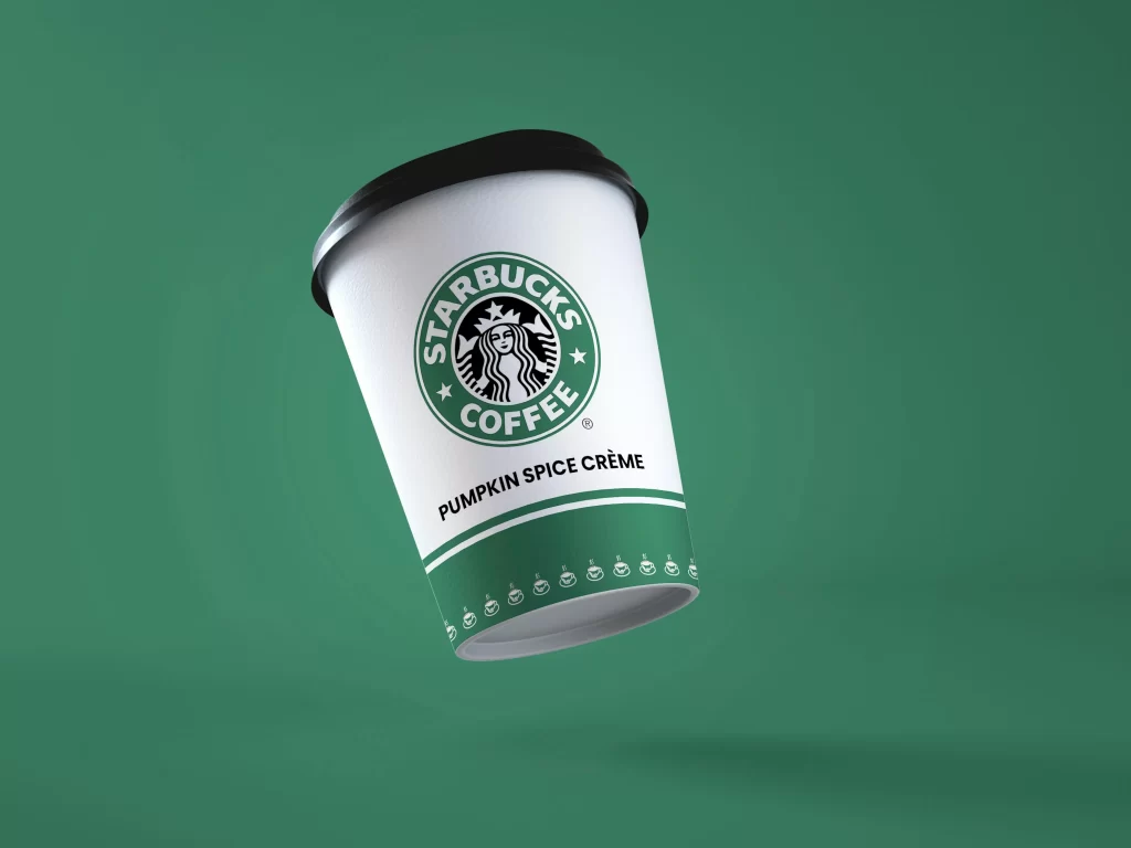
7. Starbucks: Brewing Coffee and Community
When it comes to community and experience, Starbucks stands out. The iconic green mermaid logo and inviting store ambiance create a welcoming atmosphere.
Community and Experience
In today’s interconnected world, maintaining a strong brand identity amidst global competition and economic challenges is crucial. Starbucks exemplifies successful brand management with its iconic green mermaid logo and inviting store ambiance. By creating a “third place” between home and work.
Their user and employee focused approaches, such as employee stock options and informal customer feedback methods, emphasize a person-centric philosophy.
Applying Principles to Your Own Brand
Now that we have seen the leaders in effective brand design, how can we learn from them? We have some key points that businesses can use to create strong, memorable identities that resonate with their target audience.
Understanding Your Audience
Knowing your audience isn’t just important—it’s essential. Uncover their likes, dislikes, and needs. The better you know them, the more likely they are to fall head over heels for your brand.
Consistent Visual Identity
A clear and compelling message is your brand’s love letter to the world. It should communicate your values and mission in a way that resonates deeply with your audience. Make it heartfelt and authentic, and they’ll be hooked.
Strong Brand Message
A clear and compelling message communicates your values and mission effectively, helping to connect with your audience on a deeper level.
Common Mistakes in Brand Design
Inconsistency
Mixing up your design elements can and dilute your visual identity, and even worse, confuse your customers. Stick to a consistent look across all visual aspects—colors, fonts, and business cards—to keep your brand strong and recognizable. Building a style guide can help. Remember: consistency builds trust.
Overcomplication
You may think that a complicated design will help it stand out and be memorable. But nothing could be further from the truth. Too much going on in your design is a recipe for forgettable. Aim for simplicity and focus to make your brand memorable and inviting. A clean, straightforward design is more appealing and easier for customers to connect with. Remember, less is often more when it comes to branding.

Ignoring Feedback
Turning a deaf ear to customer feedback can create a gap between your brand and its audience. Of course you can’t listen to every bad comment, but it’s important stay tuned in and be ready to adapt. Listening to what your customers have to say can provide valuable insights and help you refine your brand to better meet their needs and expectations.
Conclusion
Great brand design is a key part of a winning business strategy. By learning from the best and focusing on consistency, clarity, and creating an emotional connection, you can build a strong, memorable brand that truly resonates with your audience. If you need a hand with brand development, reach out to Brand Cloud. We’re here to help you create a standout brand that your customers will love forevermore.